
TUTO: Post-processing of an underwater photo
We saw in the previous article the advantages of the processing power of a RAW file compared to a JPEG image. You will see through this tutorial the "metamorphosis" of a raw file into a photo worked according to its own sensitivity. I will thus describe to you step by step, the main stages of development of a RAW file. The processing of these files is part of a series of actions and adjustments aimed at the different concepts that make up a photo. This succession of actions is called the “workflow”. These adjustments are in addition to the settings made during the shooting. It is important to clarify that anything that can be done with your camera, when shooting in the field, must be done at this time. This is even more true in underwater photography. The mistake would be to say to yourself, so much pi, I don't make this setting or I don't optimize this one, because I could do it later with Lightroom or Photoshop. Post-production, or the computer processing of a photo is an integral part of the process of creating a photographic work. In my opinion, this is just as important a step as the shooting itself. The main concepts that we are going to work through in this guide are as follows: contrast, tones and colors and some localized action tools. The list of actions described is not exhaustive.
The post-production of a RAW file is much the same whether it is an underwater or terrestrial photo. However, there are specificities specific to the development of underwater images.
This tutorial is aimed at novices, people who do not yet have experience in post-production and who wish to deepen this subject.
Throughout the workflow, we will work on the development of a RAW file (déRAWtissation) with Adobe Lightroom CC 2015 software.
So that you can follow the processing step by step, I am making the RAW file of the photo available to you so that you can make the same adjustments as I did. Please note, the color rendering may vary depending on the screen, especially if they are not calibrated.
As I announced above, the development of a RAW is a series of actions that aims to optimize and adjust certain concepts that cannot be achieved when shooting.
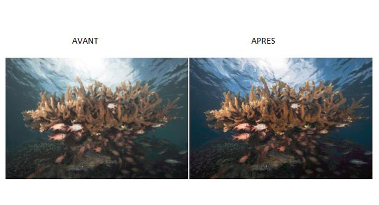
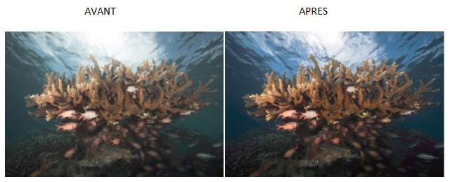
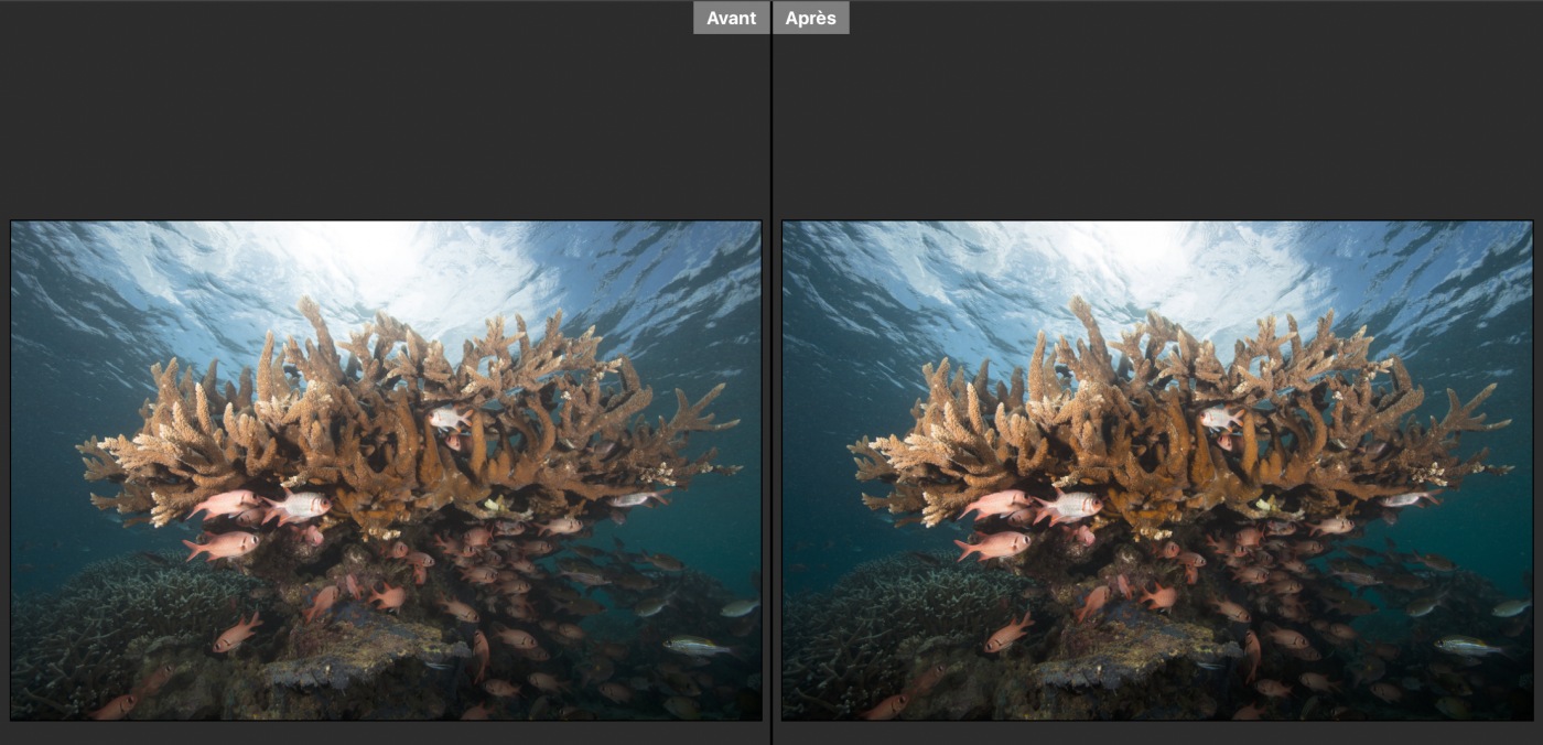
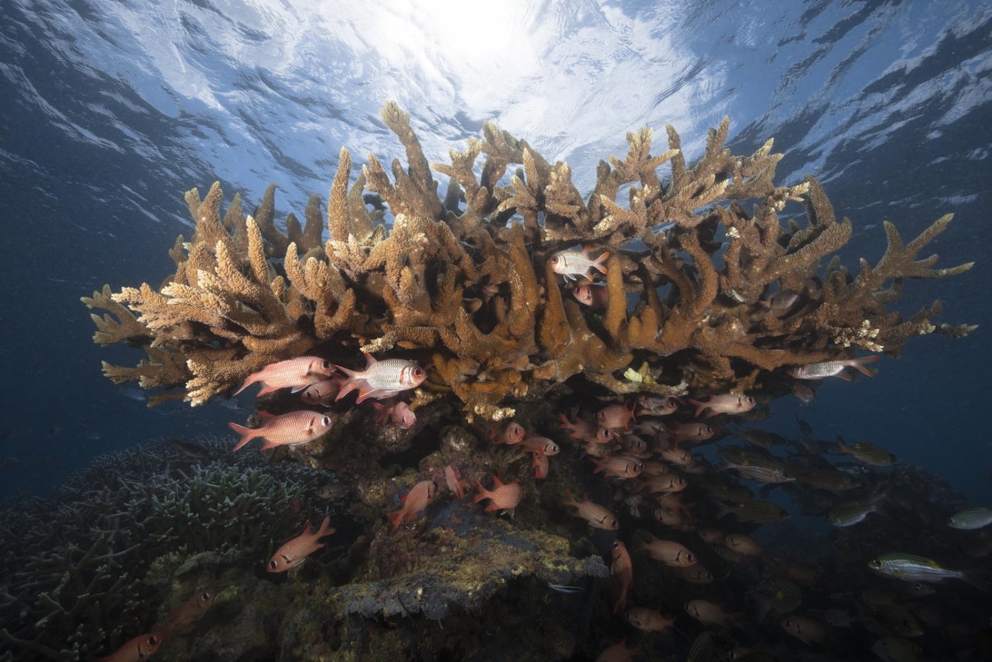
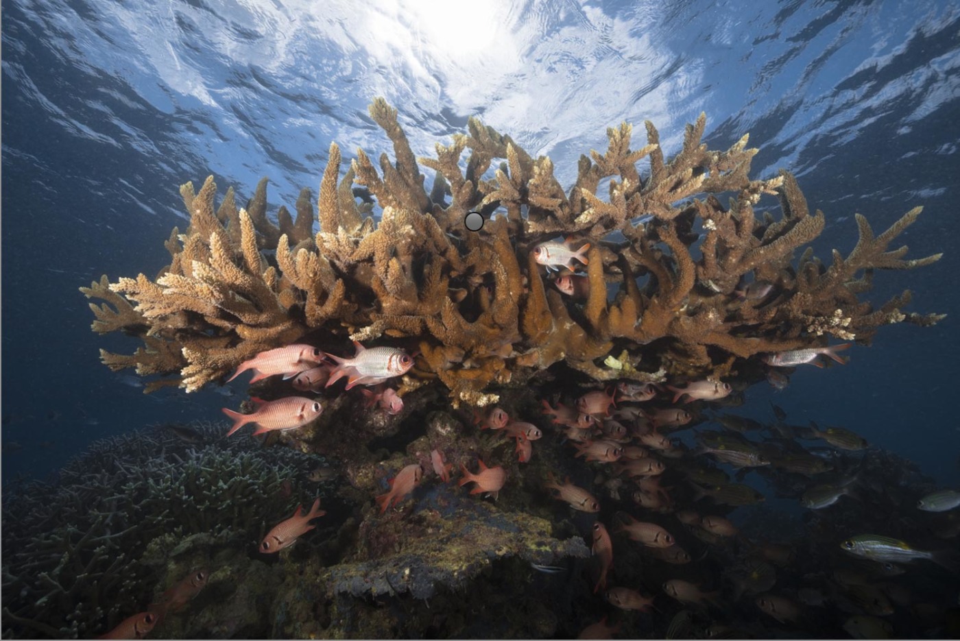
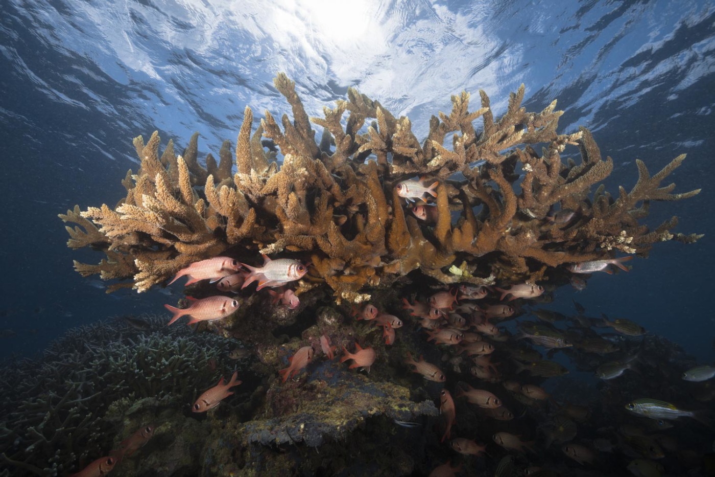
I will describe to you step by step all the actions used to carry out the processing of this underwater shot, as this before / after comparison proves:
This photo was taken at the end of the dive in the S-Pass in Mayotte. It is a photo against the light, so with a strong dynamic.
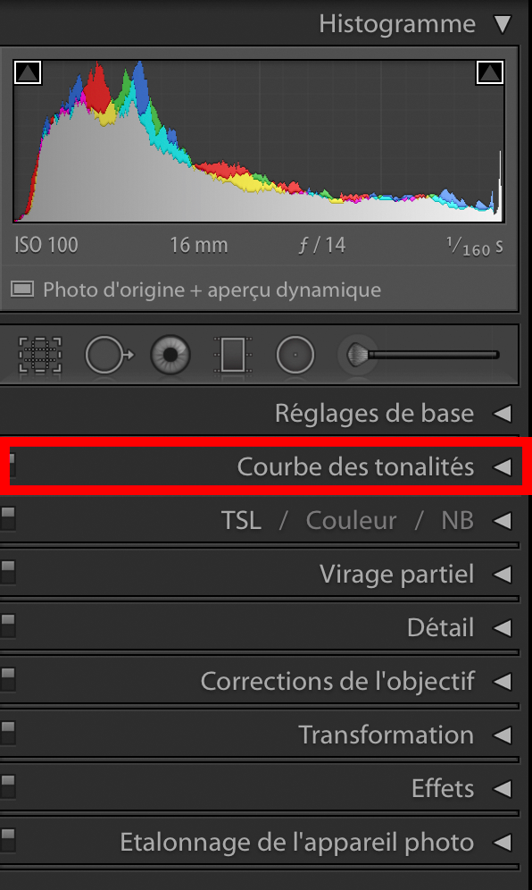
Presentation of the software interface:
First, open your photo in Lightroom and click on the tab Development.
You should have this interface:
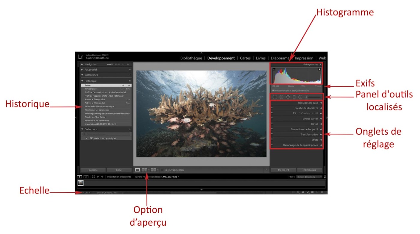
This is how the Lightroom workspace looks with all the elements or group of elements that will allow us to work on the file.
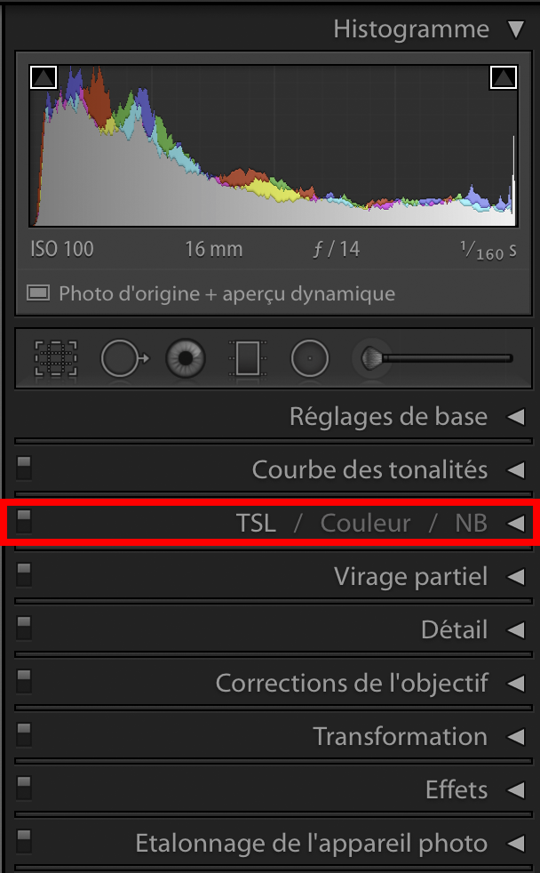
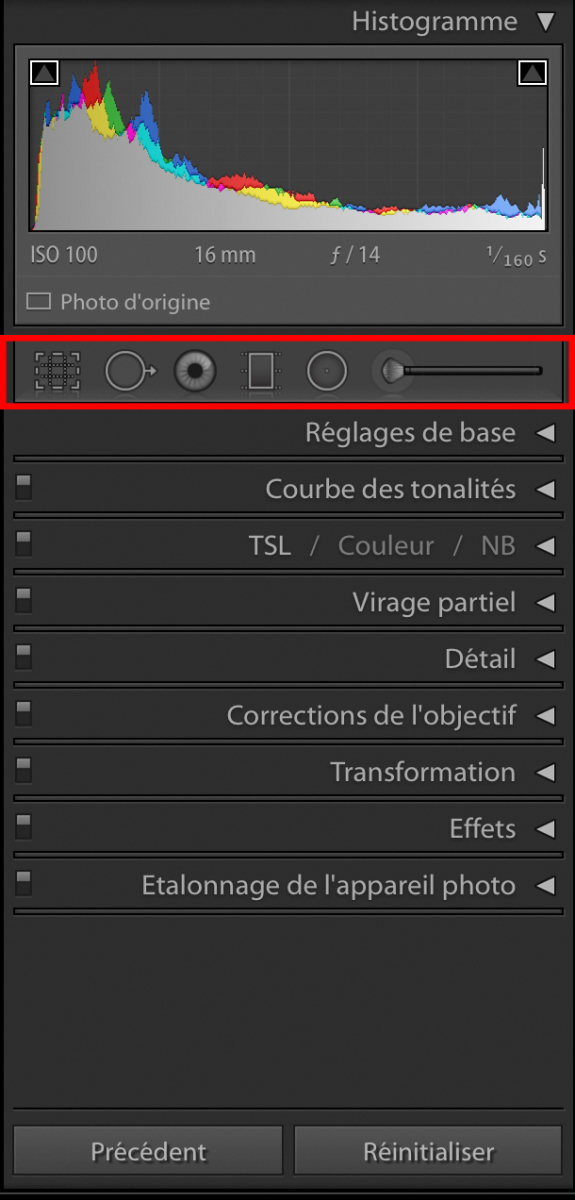
- The histogram: it is located at the top right. You can find its usefulness by returning to see my article: Fundamentals of photography. This histogram will evolve throughout the photographic processing. Each action will have an effect on it.
- Exifs: these are the indications of the shooting parameters. (Speed, Aperture, ISO but also the focal length and the lens used, here a 16-35 to 16 mm)
- The localized tool panel: this group of tools allows you to crop, correct the horizon, do a localized white balance (very practical in underwater photography), add graduated filters, make localized corrections various etc.
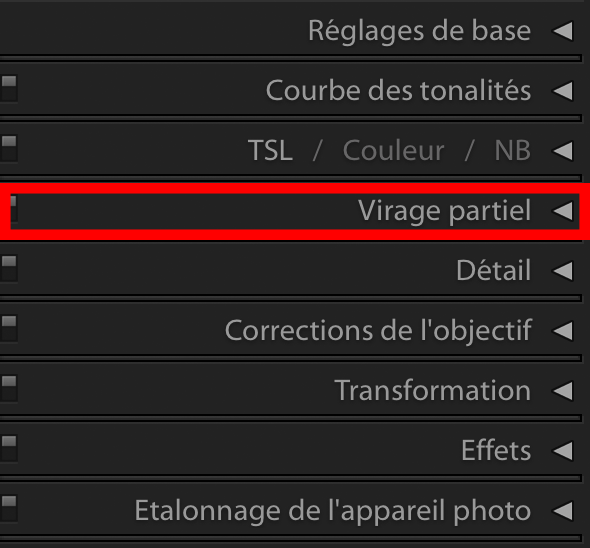
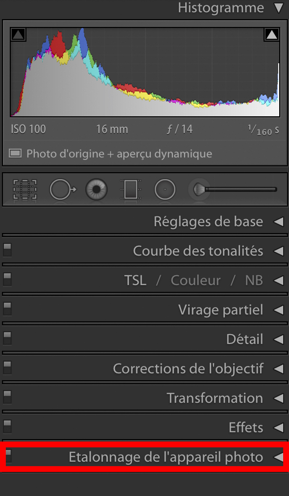
- Adjustment tabs: there are 9 of them (basic adjustment, tone curve, Detail, TSI / Gray level, Partial toning, Detail, Lens corrections, Transformations, Effects and Calibration of the device Photo)
- Preview option: this is a very practical tool that allows you to view a before / after changes made. It has several display styles.
- Scale: essential tool for zooming in or out on the photo.
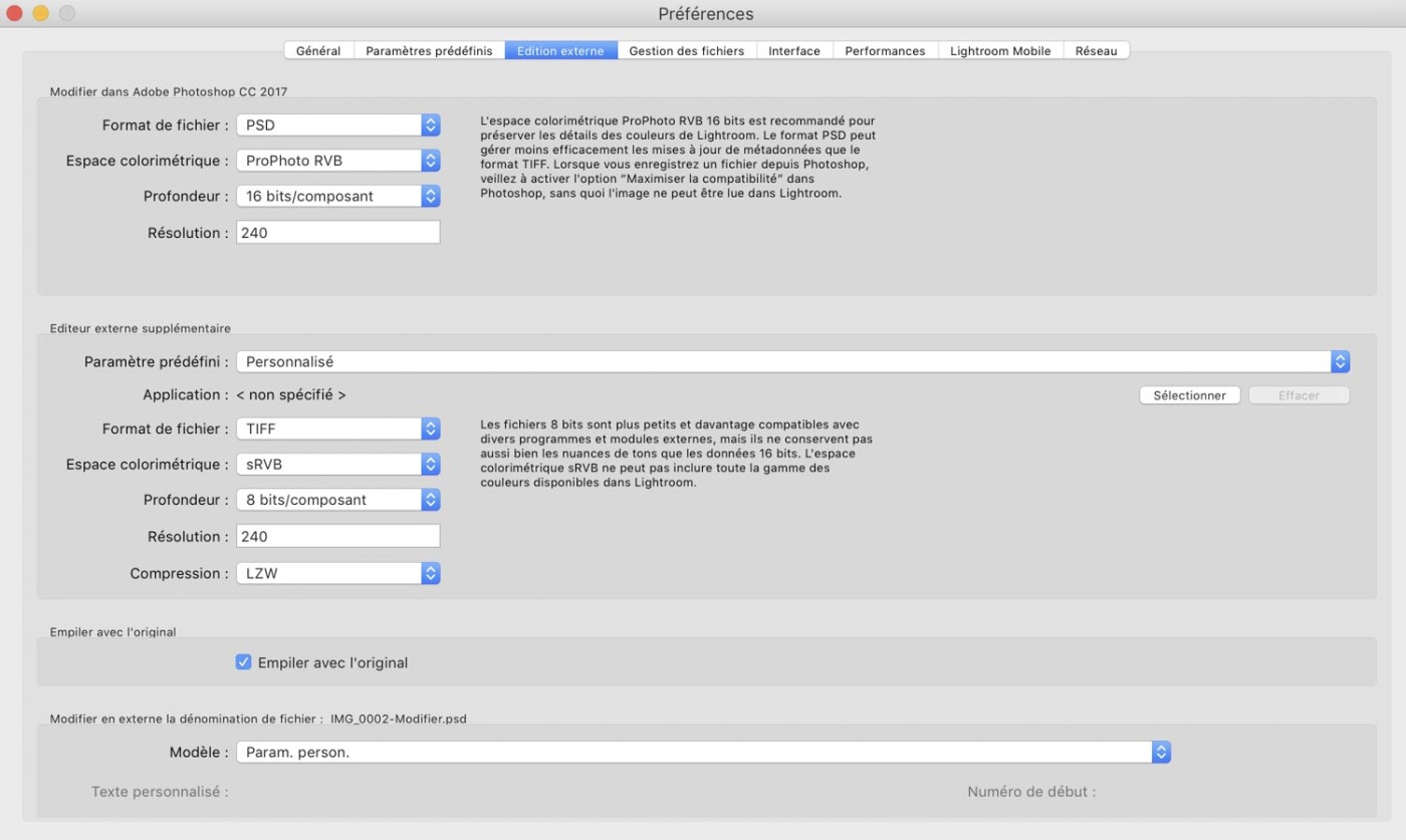
First of all, it is advisable to carry out some adjustments which will remain permanent on the software.
I am talking about the working color space and the basic profile from which we are going to work and also possibly export our photos to Photoshop after the development of RAW.
The color space under which we have to work is ProPhoto RGB. It is the most extensive color space available to us. Although most screens are not able to reproduce all the colors offered by this space, it is important to use it to have the best possible shade of color. This is even more true in underwater photography where there are many shades of blue. This space will allow a better gradient, a better transition of the different shades.
You must also select the color depth at 16 Bits / layer. Also make sure that there is no resizing.
These modifications are to be made by clicking on Lightroom => Preferences => External edition.
You will get this window:
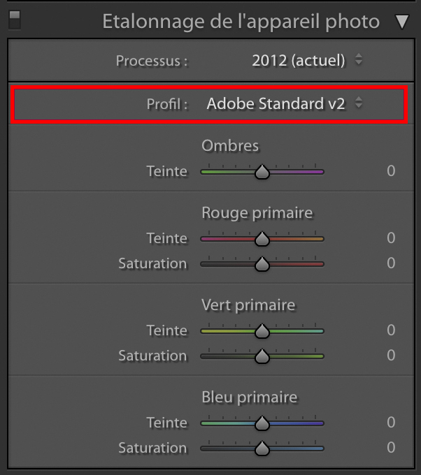
Before starting our treatment, it is important to select the profile that will serve as the basis for our treatment. To better understand what profiles are, you can reread my article on RAW Format via this link: http://www.blog.underwater-landscape.com/format-raw/
To select the profile, click on the last adjustment tab: calibration from the camera
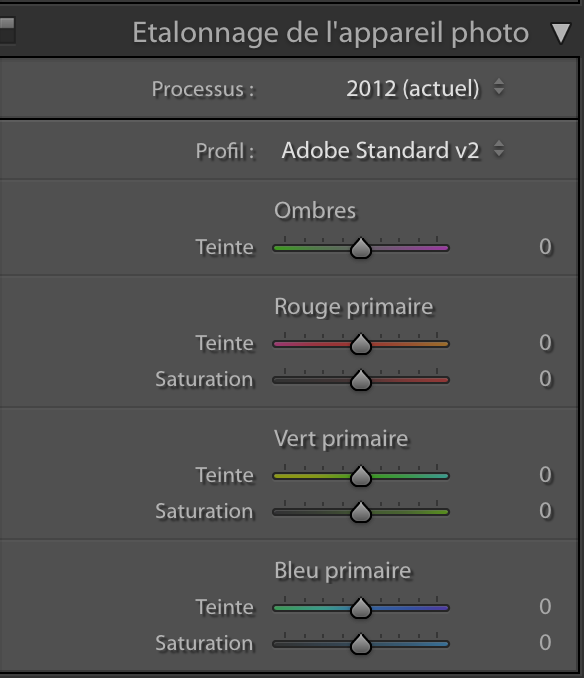
Once the tab is open, you have a whole panel of slider settings. For now, we are focusing only on the Profile menu:
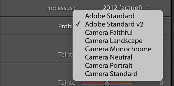
Lightroom offers several interpretations of a RAW file. These interpretations are in fact Profiles. Some of these profiles are already offered by your camera (Landscape, Portrait, etc.) while others are profiles created by Adobe. The basic rendering differs greatly depending on the profile you have chosen. Here, the goal is to select the most neutral profile possible, in order to better control the processing flow.
For this, here is a small comparison of the rendering of the different profiles.
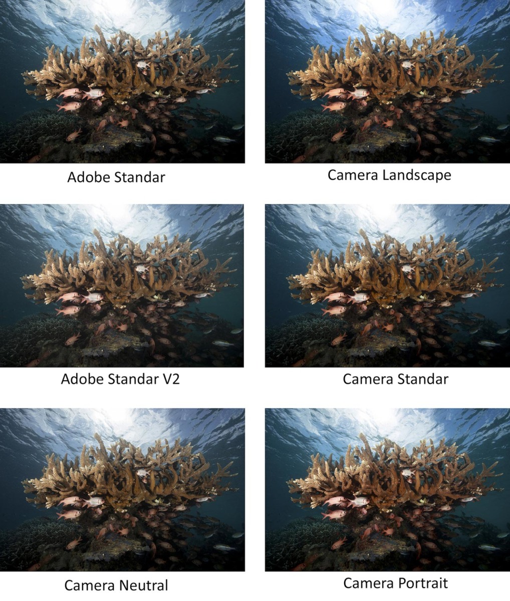
You will notice that the renderings are totally different, both on the contrasts and on the colorimetry. Certain like the profile, Camera Landscape have a contrast and a saturation of colors too pronounced for my taste.
I always select the Adobe Standar V2 profile. It is the profile which offers the maximum of detail and which is the most neutral in terms of colors. It is also very little contrast, which leaves us the entire possibility of adjusting the contrast we want.
But nothing forbids you to go on another profile, it's just a question of appreciation and interpretation.
Contrast, Tones and information retrieval:
The RAW file with the profile I previously selected is in its current dull state, without contrast. This is normal, the notion of contrast and tone is subjective. The role of the sensor is to record as much information as possible. But some, like the contrast, depending on our own sensitivity.
Contrast, like exposure, are subjective notions. They depend greatly on our interpretation and the rendering we want to bring to our photo. This is the reason why a macro photo on a black background will be deliberately underexposed, while an atmospheric photo, like this one, aims to show a scene in its entirety and requires the fairest possible exposure. .
In this case, the first of the actions in the RAW development workflow. Consists of data recovery in highly exposed and underexposed areas. In short, the recovery of so-called "burnt" or "blocked" areas. It largely depends on the dynamics of the sensor. The more recent the sensors, the more this dynamic, and therefore the possibility of retrieving information is important. This solution has its limits, it is above all necessary to properly expose your photo and adjust the power of your flashes to have the least information to extract.
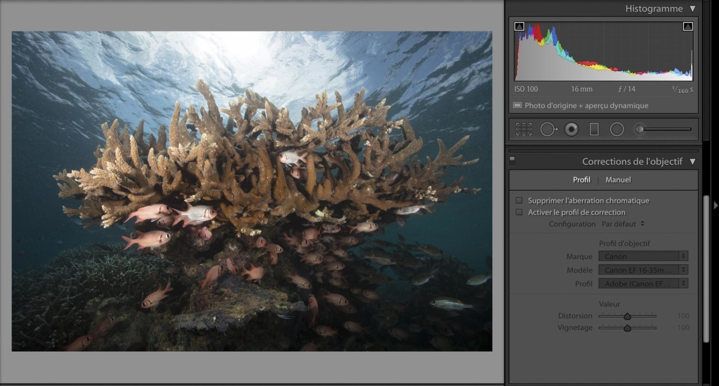
In this photo, we can see that there are no “blocked” areas, that is to say totally black. Only a small part of the sun is slightly overexposed. So we can conclude that the photo is correctly exposed and I will not need to play with the exposure slider.
There is a little trick to identify overexposed and / or blocked areas.
By clicking on the two small buttons above the histogram, the software colors the burned areas in red and the blocked areas in blue. Note in this example that there is no area to recover in the light bases, only an area close to the sun is overexposed. But this is normal, because it is the sun.
The next step is to play with the basic settings in the tab of the same name.
But before going further I will give you a few details on the cursors present in this tab:
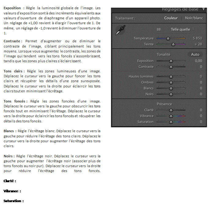
After these little details, I will try to recover a little information around the sun, the clearest area of the photo, but without trying to do too much. To do this, I use the White Tone slider which I move to the left.
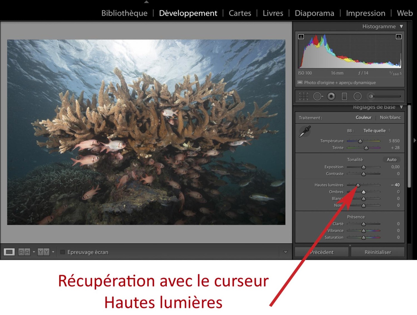
The cursor being positioned at -40%, we notice that the overexposed area is no longer marked in red. We can also note that this action also and above all had an effect on the other clear areas of the photo like the clouds near there this area.
Once the information is retrieved, the next action is to play on the overall image contrast.
The simplest solution is to vary the contrast slider. This slider relies on a preset that more or less changes the S-curve of the tones. This solution leaves little room for maneuver and it is much less precise than playing directly on the tone curve, however the rendering is often correct.
Contrast management with the overall image contrast slider:
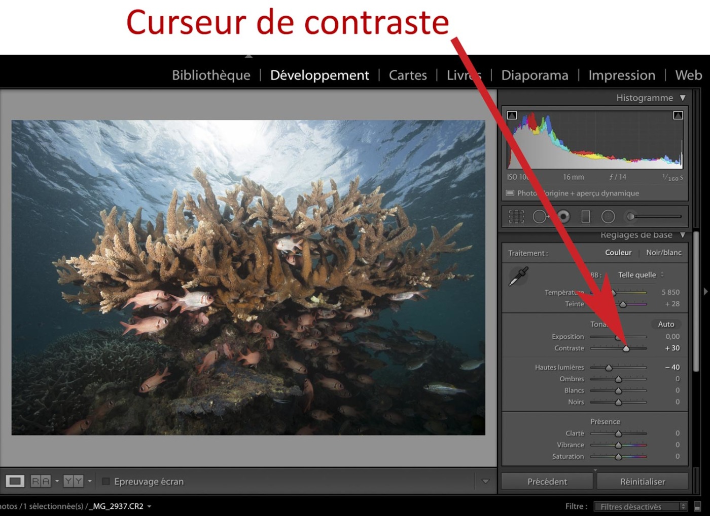
We notice with the before / after view below that the image is more contrast, the washed-out aspect of the photo fades and the relief begins to stand out.
Contrast management with the tone curve:
This is another method of adjusting the contrast of your photo. But before going any further, a little clarification on this tone curve:
The tone curve is a very important tool in adjusting the contrast. Unlike the contrast slider in the basic tool, you can play on the contrast by selecting ranges of tones with the curve. That is to say, it allows us to work on the light tones without any repercussions on the dark tones and vice versa. We can thus have a more precise adjustment than with the previous method.
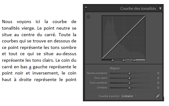
There is another way to play with this curve. It is with the points method. We can create as many points as we want on the curve to vary it as we see fit. Do not hesitate to test this method at home.
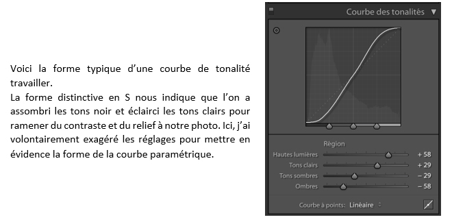
Below are the contrasts adjusted with the tone curve method. I added a little "pep" in the highlights and darkened the darker areas. The photo becomes more dynamic, the “washed out” effect disappears. The treatment takes shape.
Note: Adding contrast affects the most exposed and underexposed areas of a photo. The more the contrast increases, the more information is "lost" in the extremes. The goal is to find a good balance, the main one being the MOOD, the atmosphere or the ambiance you want to bring to your shot.
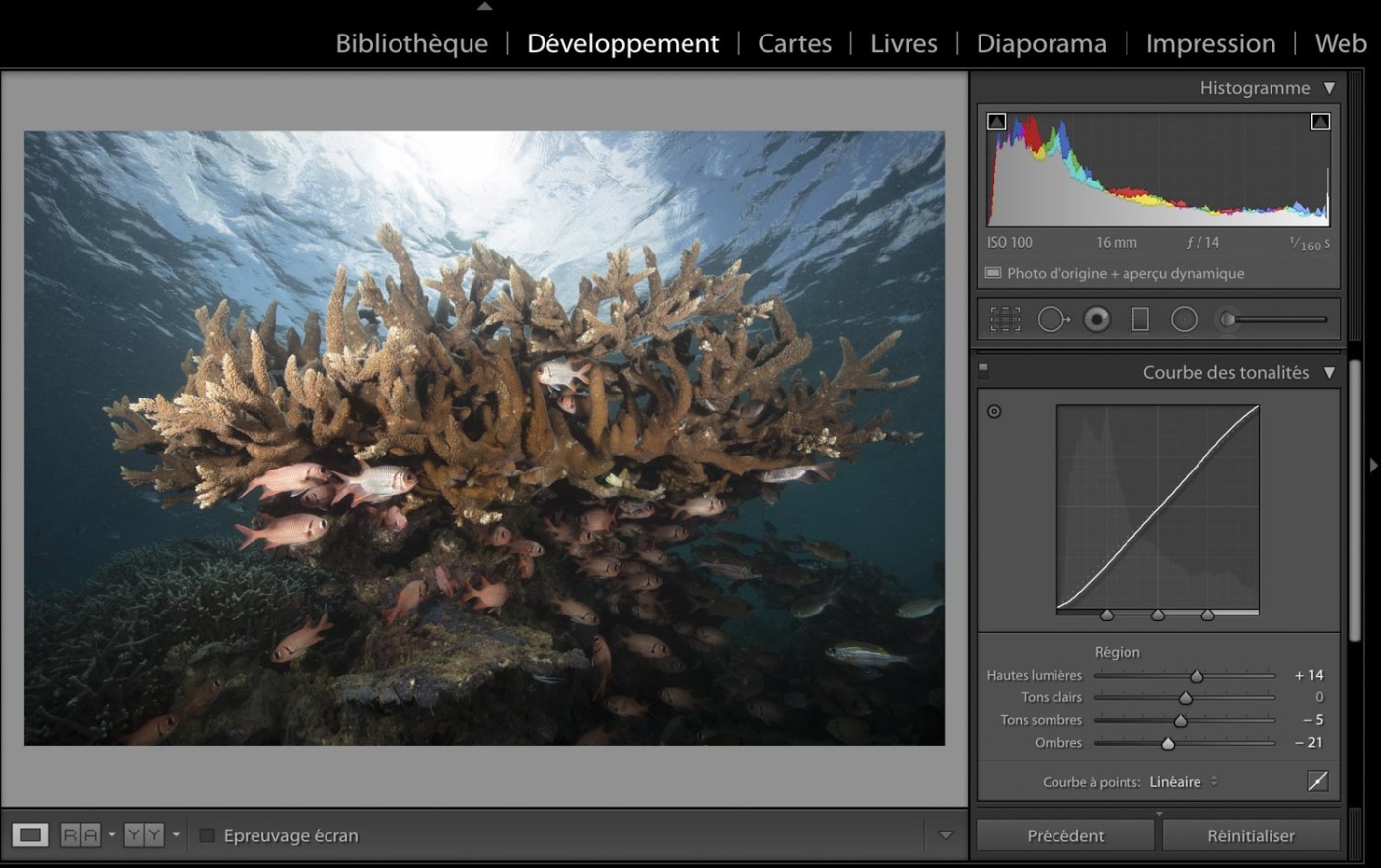
For the rest of the treatment, I keep the contrast with the tone curve (make sure that you have reset the slider of the overall contrast to zero.).
Clarity :
Clarity is the first tool in the presence category in the basic adjustment tool panel.
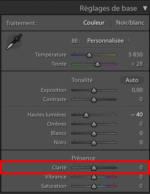
Its function is to bring out (or not) the details of the contrast microphones in your photo. It is particularly interesting to bring out textures such as grains of sand or even fish scales. It also intensifies the contours of the elements of a photo.
This tool boosts the dynamism and relief of your photo in its positive value. Conversely, it smooths it out until it “blurs” it to its negative value (which I personally never use).
When I started computer processing, I used clarity a lot to add “pep” to my photos. But over time, with experience, I have come to realize that this attractive tool should be used with extreme caution. So much so that I hardly use it anymore, or only at particular points in a photo. The abuse of clarity distorts the photo, it becomes less "soft" with sometimes a metallic aspect.
The example below is much more telling than a few words:
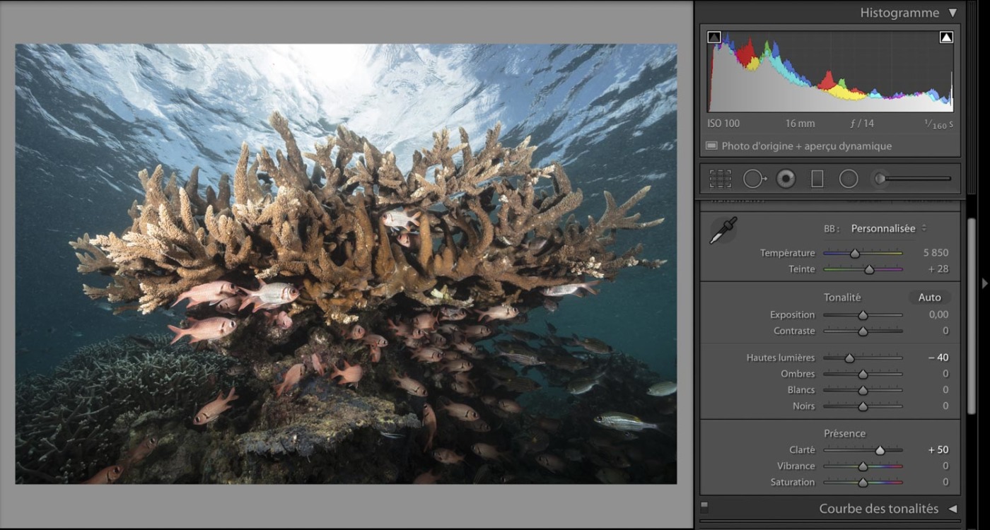
For this treatment, I will not add clarity, I find the photo already very dynamic with a relief highlighted by the management of the contrast that we carried out previously.
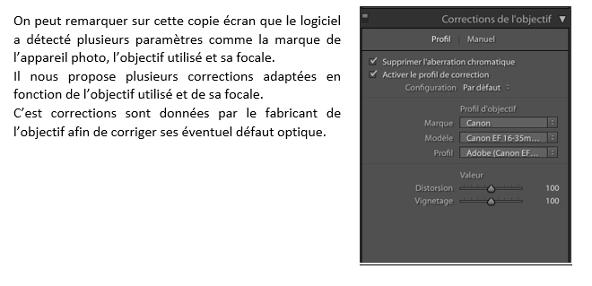
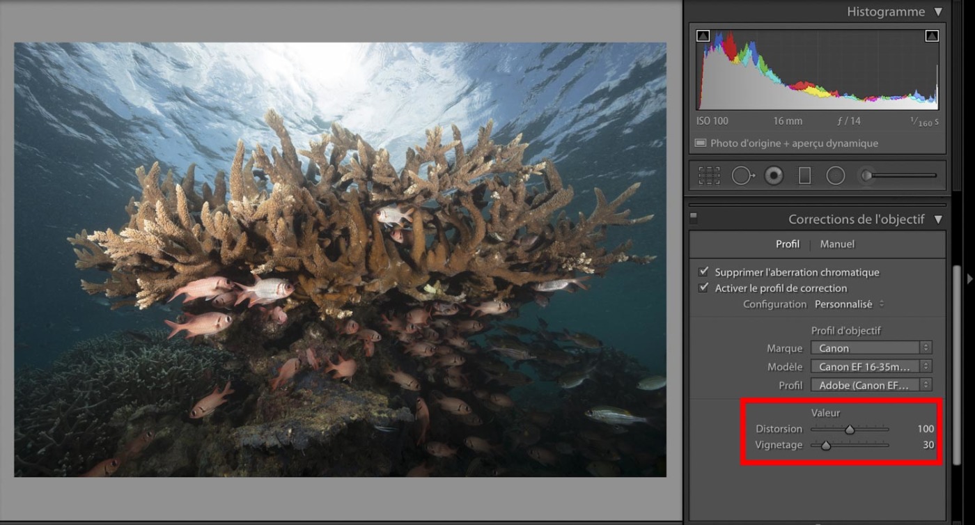
Lens corrections:
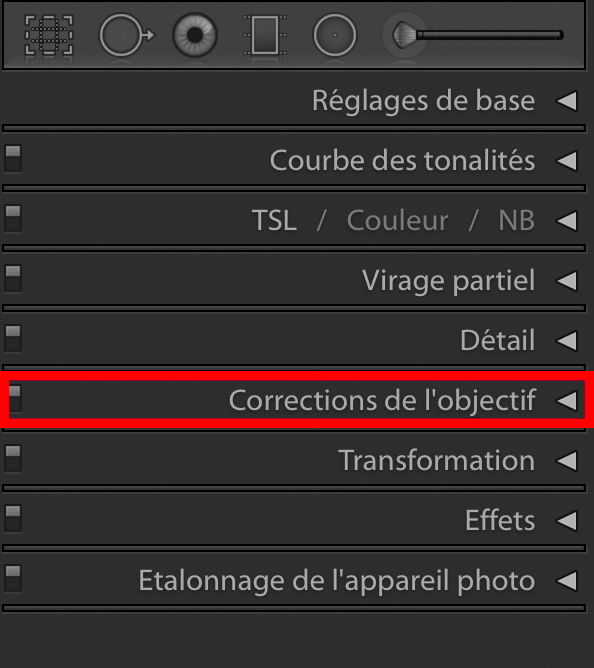
Lightroom has a feature that detects the lens used in this way and offers you a correction for chromatic aberration and vignetting. The correction of chromatic aberrations must be made each time.
Below is a screenshot before and after lens correction.

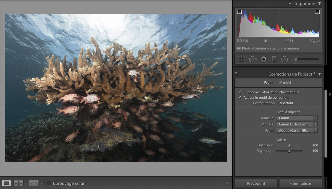
We notice a difference in rendering on the contours of the photo. Indeed, the correction of vignetting "brightens" the contours which are darkened by the optical default of the lens. In my opinion, this correction is not systematic. It's really on a case-by-case basis depending on the photo and its composition. I almost always add vignetting to my photos to guide the eye to the subject. So this is not a correction that I do regularly. Note that vignetting also depends very much on the quality of your lens. The higher the quality of the objective, the less vignetting will be present, or at worst, better manage in its distribution.
For this photo, I'm going to keep some lens vignetting, so I'm going to apply this correction up to 30%. Why this choice ? Because the darkened edges of the photo focus the gaze towards the center of the photo, where the subject is. However, I keep the distortion correction almost every time.
Colors :
Here's another big chapter in computer processing. Colors !!! The interpretation of colorimetry is specific to each person. And as I already mentioned in my previous RAW article, your camera's screen feedback isn't the absolute truth. Even more in underwater photography, the color or colors are greatly affected by the water column. The fineness of the color treatment evolves according to your experience. As with good wine or cheese, it matures over time. The most common mistake is that of “too much”. The main cause is too saturating the colors. And believe me, we get there really quickly. Color harmony is also very important. Beware of dominant colors (due to poor white balance or poor lighting).
There are several tools for working with the colors of a photo.
- The tool Temperature and Tint.
- Management of each color in isolation in the tab TSL / Color / NB.
- The tool Partial turn, which influences, according to our choice, the colors of the highlights and / or the light bases.
- The tool for modifying primary colors found on the Camera Calibration tab.
First, we will see the management tool for Temperature and Tint which is in the basic settings:
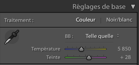
We see here that the temperature is 5 degrees Kelvin. This setting depends on that of your camera. For this dive, I let the device manage the color temperature, but I sometimes adjust it manually.
By changing the slider, you can adjust the colors to make them warmer or cooler.
Here are two exaggerated examples of what is possible with this tool:
Above, a color temperature of 7000 Kelvin.
We immediately notice that all of the colors are warmer. They are turning yellow.
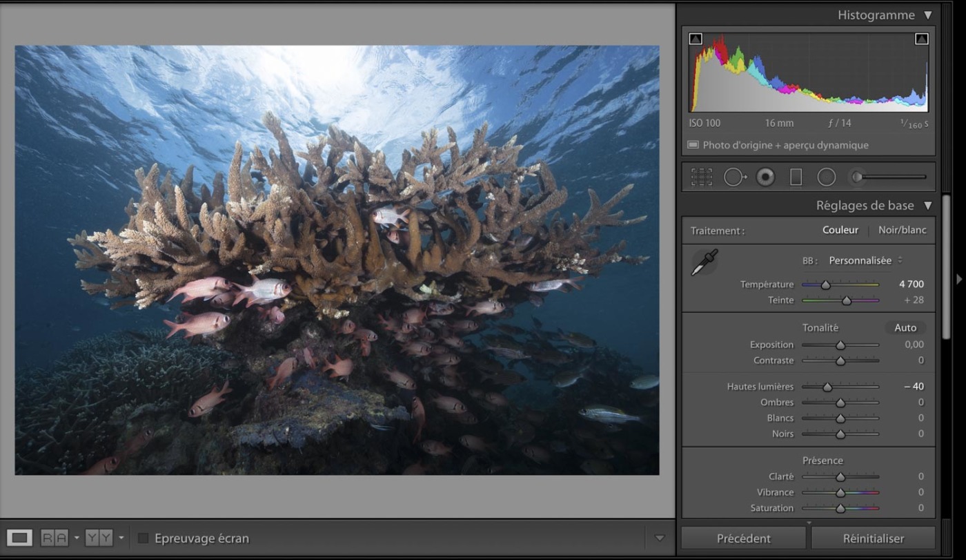
Above, a color temperature of 4700 Kelvin.
Unlike the previous one, we notice that the colors tend towards colder shades, therefore towards bluish tones.
We can see that the temperature influences the entire color spectrum of the photo. Be careful, the rendering can differ greatly depending on the screens if they are not calibrated by a colorimetric probe. Generally speaking, underwater photos perform best with a temperature between 4800 K and 5500 K. For this photo, I will leave the color temperature as is, at 5850 K, because I find it to be fairly well balanced that way.
For the Hue slider, it is exactly the same as for the Temperature slider, with the difference that the color spectrum will draw more or less towards green or magenta. And as for the Temperature, I would not change this value.
Still in the Basic settings tab, we have two sliders to accentuate the colors.
These are the last two: Vibrance and Saturation.
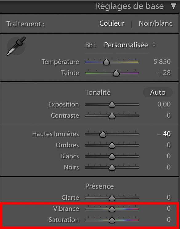
What is the difference between vibrance and saturation?
The saturation of a color in colorimetry is in a way the intensity of its hue. A saturated color tends more towards fluorescent whereas a less saturated color tends towards a pastel shade.
For vibrance, the definition is much less easy. You must first know that it is a concept popularized by Adobe.
Here is their definition: " The Vibrance setting adjusts saturation to limit clipping of colors near the maximum saturation level. This setting increases the saturation level of weakly saturated colors so that it is higher than that of already saturated colors. It also helps prevent excessive saturation of skin tones. "
We can therefore conclude the difference between these two notions.
Saturation increases the intensity of the hue of all colors while the vibrance selects the less pronounced colors (mid tones) to intensify their hue without impacting the already dominant colors.
In underwater photography, the vibrance has an advantage to increase the colors of the subjects, without modifying the dominant colors too much, blue in most cases.
But beware, you have to play sparingly on these sliders !!!!
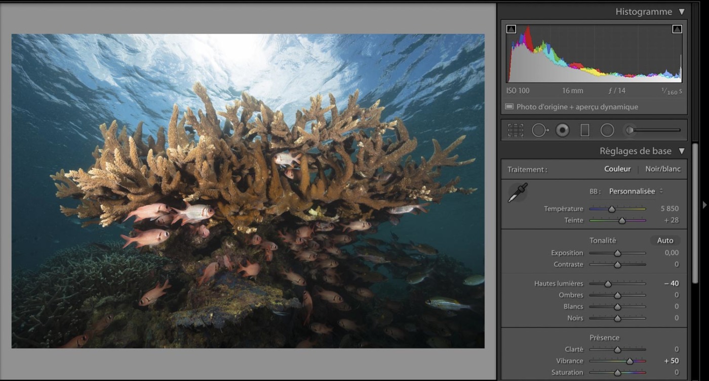
For example, here is the vibrance pushed to 50%:
And now the saturation pushed to 50%:

We note that the saturation pushed to 50% gives a rendering which does not seem at all natural while the vibrance at 50% does not fall into excess.
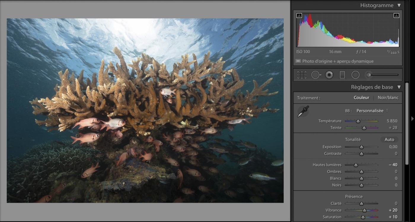
Obviously, I deliberately exaggerated on the sliders for these two examples. I never exceed 20% in vibrancy and 10% in saturation. These are the limit values that I have set for myself in recent years. Beyond these thresholds, the rendering no longer seems natural to me.
Here is the rendering at 20% vibrance and 10% saturation:
The TLS / Color / NB tool:
To modify a specific color without impacting the others, we will use the tools on the TLS / Color tab /NB.
There are several presentations of this next tool or you click on TSL or Color, but it is actually the same thing.
You can modify 8 distinct colors: red, orange, yellow, green, blue-green (cyan), blue, purple and magenta.
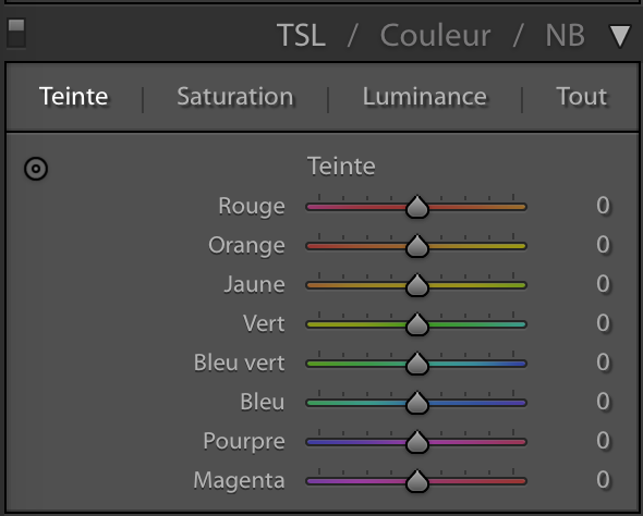
On each of these colors, we can influence 3 concepts: Hue, Saturation and Luminance. This allows us to make precise adjustments for each color without modifying the others.
For our example, I find that the blues draw a little too much towards the green and that bothers me a little.
I'm going to change their hue by pushing the cyans (blue-green) slider to the right, like below:
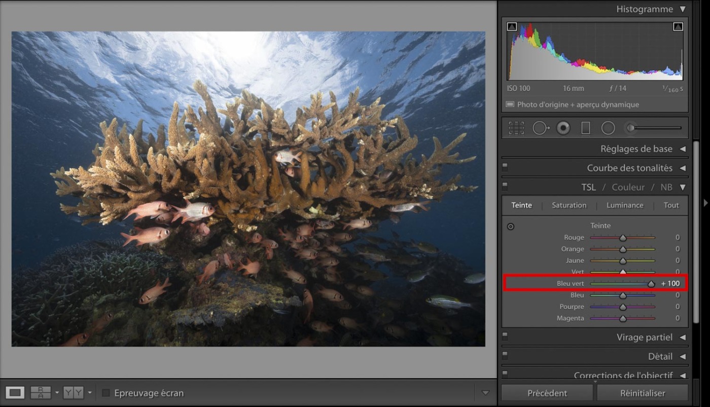
Note: cyan tints have a huge influence on the rendering of blues in a photo. It is the color to work on before all the others.
I'm not going to play with color saturation with this tool, because I already adjusted the saturation previously. But nothing prevents us from pushing / lowering the saturation of a color if it seems inadequate or on the fringes of other colors.
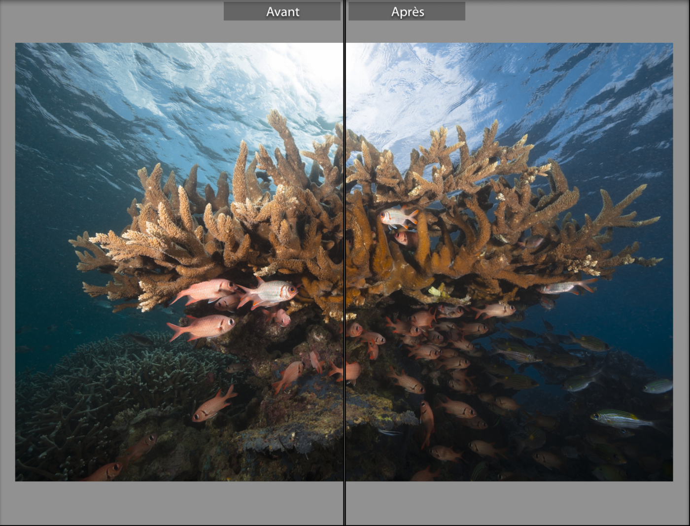
We get a blue that no longer pulls towards green. It is up to everyone to determine which color is best for them.
Partial turn:
This is another method of adjusting the colors of highlights and / or shadows. In this case, you cannot select a specific color. It is the whole color spectrum of highlights or shadows that is modified. Although it is a tool that I sometimes use in landscape photography, I never use it in post production of an underwater photo.
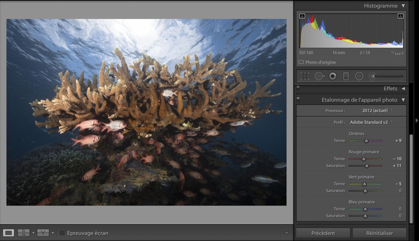
There is a third method for adjusting colors. To do this, we go to a tab that we have already seen: Calibration from the camera :
In this tab, we have seen the available profiles (standard, landscape, etc.). But there is also a series of sliders which aim to modify the primary colors: red, green and blue (RGB) as well as a slider which plays on the hue of the shadows. If we modify one of these sliders, this will have a direct impact on the primary color, but also on all the secondary colors that result from it.
To give you an example, I would like to bring a little more red on the soldier fish which draws a little too much on the yellow for my taste. You will see from the before / after comparison below that the change also has an impact on the warm colors of the coral. Do not hesitate to vary the sliders, even in the extremes to clearly visualize the renderings possible with this tool.
Before calibration:

After calibration:
At this point in processing, the heavy lifting is done. The overall look of the photo suits me. But there is still a large number of possible actions. Especially with localized action tools or graduated filters.
I will not go into all the action tools localized in this tutorial, nor on the two tabs Transformation, Detail et Effects. But I strongly encourage you to test them empirically. It's a great way to learn.
However, we will see together the possibilities offered by the tool Graduated filter.
The graduated (or degraded) filter is, as its name suggests, a "progressive" filter. This filter can be rotated in any direction and its graduation can be changed as you see fit. It is particularly effective in landscape photography, for working on skies for example. In underwater photography, it is useful for working on the surface of the water.
The Graduated Filter tool is located in the localized tool palette, it is the small rectangle circled in red on the photo below.
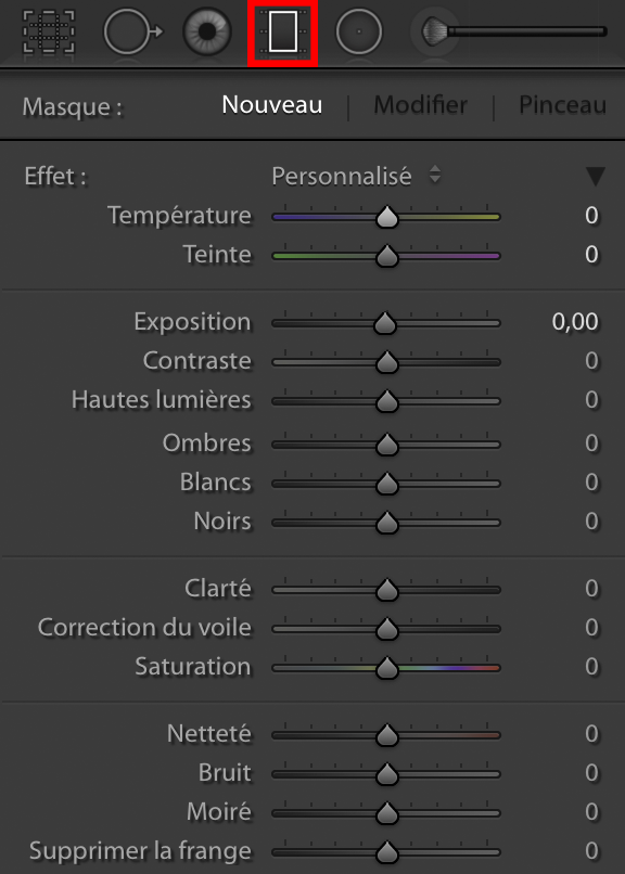
Once you have clicked on this small rectangle, a series of cursors will appear. They are almost the same as the adjustment sliders. But before modifying anything, we must first position the filter on our photo.
To do this, click on the place in the photo where you want the filter to start and move the mouse cursor to where you want it to stop.
Which gives us this:
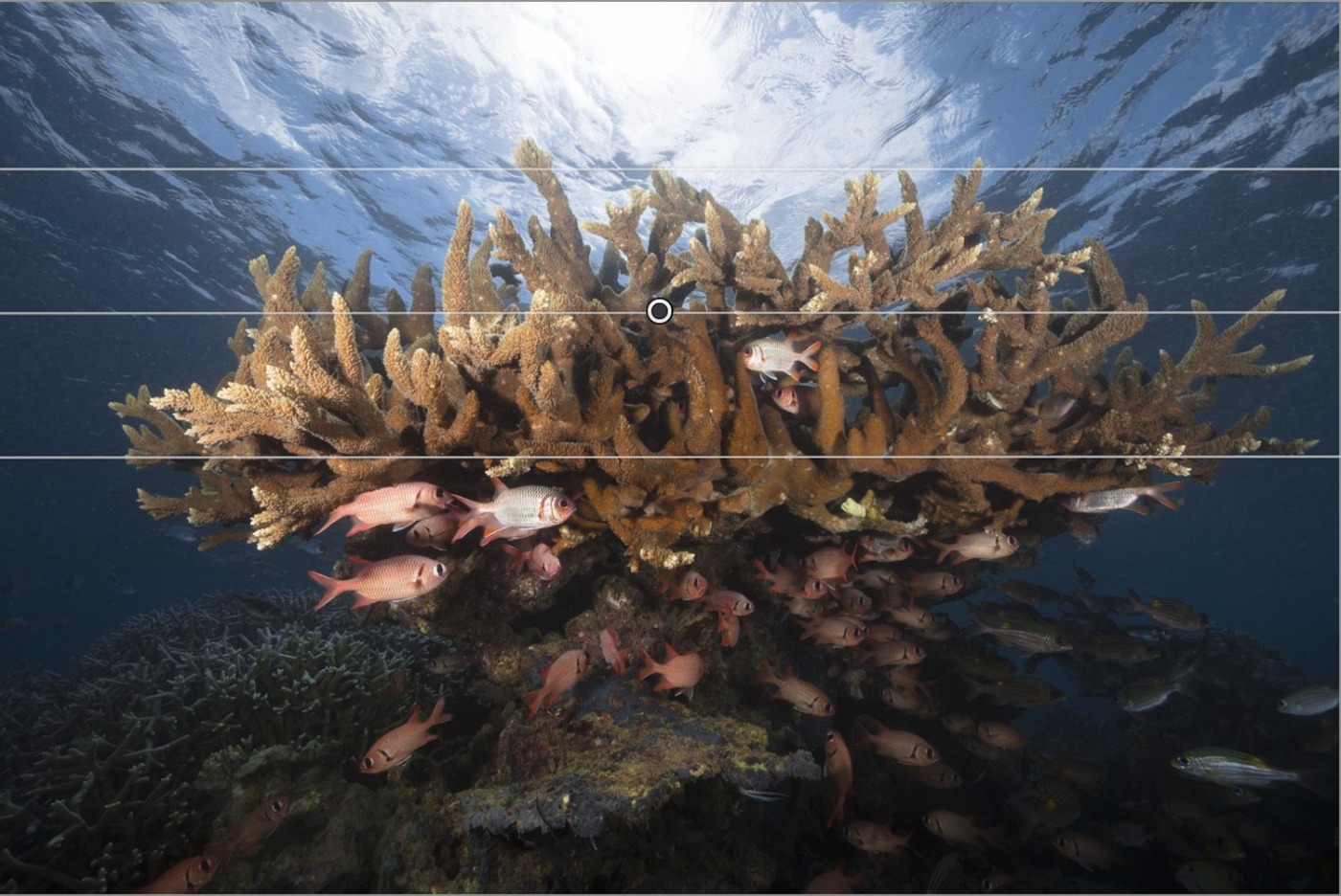
We have 3 lines that appear. All changes will be 100% above the top line.
The filter will be graduated gradually between the top line and the bottom line which is 0%. So anything below the bottom line will not be changed.
Of course, the distance between the top line and the bottom line is adjustable as needed.
Here is an example of the rendering we can have:
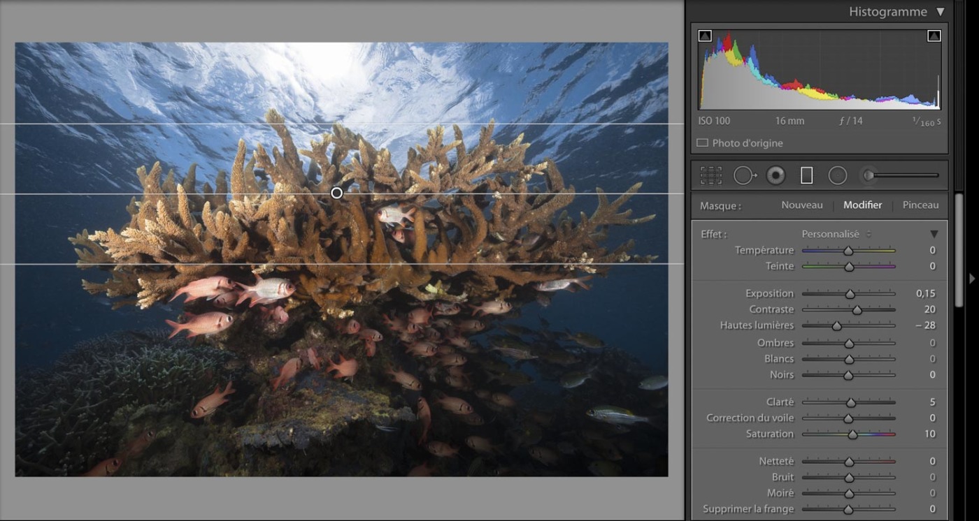
We can see in the photo above that I have changed the exposure, contrast, highlights, clarity and saturation sliders. All of these actions / modifications have the effect of giving a little "pep" to the surface of the water while retrieving information in the highlights of the sun.
Without graduated filter:
With graduated filter:
This tool comes at the end of processing. It's sort of a finishing tool. But like all post production tools, you should use it sparingly without trying to overdo it. It must remain imperceptible to the eye. Otherwise, it's gone too far.
Processing under Lightroom is now complete. Below, the final result speaks volumes. The recovery of information, contract management and colors lead to this photo. Although it is different from the RAW file, the work provided on this underwater photograph remains faithful to the scene that I have in memory.
As in the past in film, the processing of the RAW file corresponds to the development of a film photo. The photographer replaced his darkroom with his computer. Digital processing, and I am talking about processing and not “retouching”, is an integral part of the process of creating a photographic work whose raw material is the RAW file created during the shooting. It is part of a series of actions (work flow) which aims to imbue and sublimate an image through the emotions, feelings, vision and experience of the photographer.
This underwater image processing tutorial is a guide. It is imperative that you familiarize yourself with your processing software. There is no secret, the more you work on your photos, the better you will become. Your sensitivity will evolve according to your know-how. It will refine over time. But above all, you will have to spend a few hours behind your screen. What seems tedious and empirical for the moment, will become a real pleasure when you master the various tools seen previously. The knowledge and experience you will acquire in computer processing will change the way you photograph. You will no longer take pictures to have a nice preview on the screen return of your box! No, you will shoot according to the possibilities of your camera and the one you have in post-production. But never forget one essential thing: everything what can be done at the shooting, must be done at that time !!!!